Posts

Nived: Because Life Makes Wrinkles

Image
This is the creative advertisement by  Jung von Matt, Germany for Nivea, within the category: Health. This creative advertisement is about mi ddle-aged men got to see a reflection of themselves in this creative ad for ‘Nivea Men Active Age Moisturiser’ that showcases how the burden of children, broken cars, or building a home can hurl a world of worry at them and make them appear older than they are. Besides that, this advertisement has a strong  message and the call to action is good. Moreover, I do like the idea of combining two unrelated visuals (men and car) that making the more eye-catching .  This ad campaign is a clever take on how men may not be able to avoid a midlife crisis, but they could sure look good while they’re at it.  

Ford- The City In your Hands

Image
 This is the creative advertisement by the Ford company to introduce the  Ford Fusion car . I do like the way they presented their new model car by just using the car key to symbolize the function of this car.   I t is a direct representation of a car key, but a symbolic representation of a city skyline. I really like their idea of the shape key to change into the city skyline. This shape successfully represents the whole meaning of this advertisement. W hen the audience look at the advertisement , it will create an adventurous feel for the audience. Moreover, an advertisement like this is easier for the audience to adapt meaning " The City In Your Hands".

Tomorrow Start's Tonight- IKEA

Image
  This is the creative advertisement by IKEA UK & Ireland. This advertisement looks creative and imaginative when the supplement changed into the pillows. I really like this concept of changing the sleeping supplement into the pillow to show this pillow works as a sleeping supplement. This advertisement   is  intended to imitate the effects of a good night’s sleep – filled with Ikea bedding pills as well. A creative unusual advertisement like this will easily attract the audience to see because this advertisement idea is very imaginative. Besides that, I'm impressed with the way they tried to match their product with the sleeping supplement pills to make the audience understand by looking at the visual instead of reading at the body copy.  

IKEA Ad HEMNES Cabinet

Image
 This is the creative advertisement by TWBA Agency to their client IKEA.  IKEA is pretty clever when it comes to advertising and catching the public's attention. The ads feature different styles of shoes, all stacked within each other.  The idea behind the Ikea Hemnes ad campaign is to demonstrate the versatility of space and the ample amount the user would get if they bought the Hemnes cabinet. I do like their creative concept of these two shoes are stacked together due to lack of spaces to arrange.  Besides that,  IKEA HEMNES used a creative and funny way to describe and grab the attention of the audience.  From simple, classical design with a touch of tradition to creativity, this image alone is the best to describe IKEA is a perfect shoe cabinet. 

IWC Big Pilot Watch Bus Advertisement

Image
Watchmaker IWC’s advertisement. Bus straps are designed by images of IWC’s Big Pilot’s Watch to allow bus travellers near the airport to try before they buy at Berlin, Germany. I do like their creative ideas that  need to try a watch before buying. If the watch looks fashionable to them and attractive on their wrists,they will mostly likely buy. Besides that,  I think the message of this advertisement is that IWC’s Big Pilot’s watch helps people to have stable lives and the message is conveyed non-verbally to consumers. When the bus jerks, people may be unstable and need to hold on to the bus straps to stabilize themselves. From here, they will attracted to this straps advertisement and they will keep try to match the watch to their hands. An advertisement like this on bus strap is very rare and it could attract many people to see the advertisement. I think their creative idea on the bus strap could  increase the chances of a higher sales for IWC.  

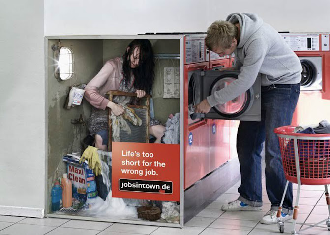
Jobsintown.de: Life’s too short for the wrong job

Image
 This is the creative advertisement by jobsintown.de Germany for their online recruitment website. This advertisement looks creative because of the concept of choosing a girl struggling to wash a lot of clothes showing that the wrong job will make your life hard. An advertisement like this could make us to imagine and make our imagination to fly about this concept. Besides that, t hey have made these amazing advertisements with the slogan “Life’s too short for the wrong job”. Over the years they have come up with several other print adverts that have the same idea of a real person operating the machine. This campaign has won many awards. An ad like this will make the audience to see and interpret.

MacDonald's Malaysia Advertisement- OOH Campaign Celebrations

Image
  This is one of the most famous and popular advertisements of Mcdonald's Malaysia. This advertisement had gone popular and famous on social media 9 months ago.  These billboards are part of McDonald’s latest OOH campaign celebrating Malaysia’s famous sights and sounds which are unique to each location .  This advertisement is very creative because they've used their food item like french fries and ice cream to feature the iconic landmark from each state across Malaysia.    These locations include the Penang Bridge,  Petronas Twin Towers,  Sunway Pyramid, turtle nesting in Terengganu, and Batu Caves.  The first image shows a billboard with two sundae cones joined by a single fry depicting the Petronas Twin Towers with the caption “Semoga kita berjumpa lagi di Kuala Lumpur” (May we meet again in Kuala Lumpur).  Another interesting one is a billboard featuring a chocolate sundae which comes with the words “Tinggi-tinggi Gunung Kinabalu”, the title of the iconic Sabahan song by Ki